Hero Banner Guideline
The Hero Banner Guideline is a core system for all marketing banners. It defines consistent layouts, typography, and visuals. This keeps every campaign clear, on‑brand, and easy to scale.

The Brief
The goal was to create a 5 t-shirt-size scale for banners. These banners would need to scale across the entire Dell.com and serve as a guide for internal and external designers and developers.
Banner Sizes
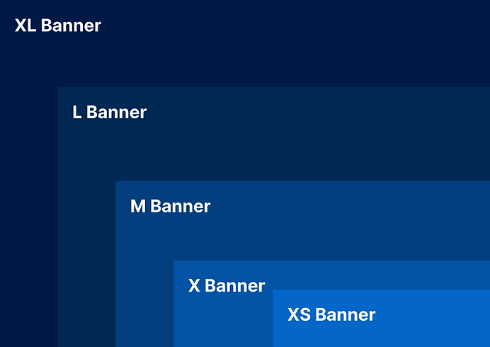
05
The simplest way to direct users to promotional content at the top of a page is with well-constructed and concise messaging.
XS Banner
01
Accommodates media content with a focus on showcasing promo videos or captivating content
XL Banner
02
With the same focus as its bigger variant, in a smaller form factor. Better for below-the-fold content exposure.
L Banner
03
Restricted to product or lifestyle images that clearly set expectations for the end user.
M Banner
04
S Banner
A smaller banner with the focus to deliver context via text with no media. Best use case for pages with prioratized content below the fold.
Banner Styles
Full Card
Split 40/60

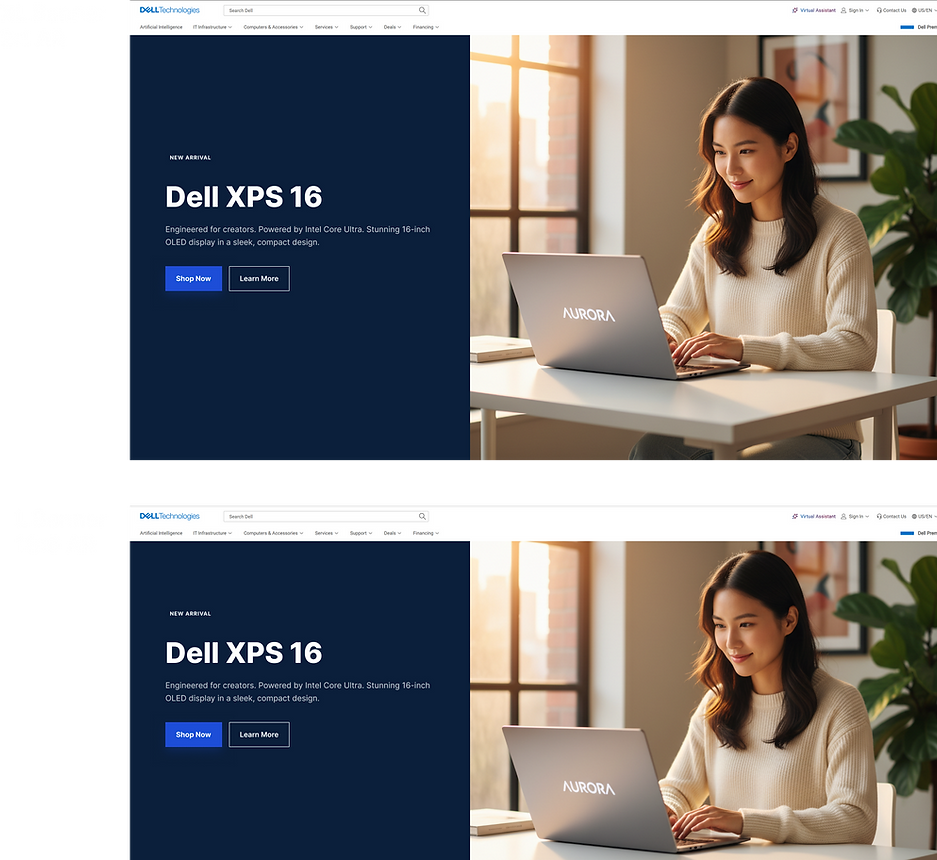
Full card banners are centered around displaying attention-catching media, with video being the most effective format, providing the best context.
Splitting banners 40% copy to 60% media is very effective at adding space for a short description and media to accompany the messaging.
Floating Card

Floating card banners allow the use of background media without disrupting the messaging. Makes it easy to keep copy accessible while displaying media, and it can be scaled.
Responsive Banners


3
Strip banners
The strip banners had one function, and that was not to obstruct the below-the-fold content, as that was the page priority. The bigger the banner, the better the media usage affordance. Banner M and S could use media. Banner XS could not, as media had less impact.
3
2
L Banner 16:6 AR
The large banner follows suit with its larger variant, but with a smaller footprint. Some pages relied on their primary information below the banner, so accounting for visibility gave the banner size a purpose. This banner's unconventional AR made its priority the information below the fold rather than media within.
Image: L banner 16:6
1
XL Banner 2:1 AR
Applying this aspect ratio (AR) to the XL banner made it responsive and scalable, taking up a percentage of the space. It works alongside the available styles. Good for playback videos and attention-capturing media. 2:1 aspect ratio was a widely adopted media format at the company.
Image: XL banner 2:1
1
Desing Process
This process was divided into segments: first, understanding what the project constraints are and where we can allow flexibility.
The second phase was looking for all the moving parts to compose banners, ranging from typography, sizes, styles, colours, media, spacing, etc.
I presented to my fellow designers to gather feedback on the presentation and unclear instructions, seeking clear pain points before producing the final Figma shareable link for public access.

The Final Impact
Implementing the Banner Guideline project significantly reduced design turnaround time and improved brand consistency across all digital channels. By standardizing components and logic, designers and non-designers could produce high-quality banners with less friction and stronger brand and marketing alignment. This project later influenced vertical banners, carrying over this work.
70%
Faster Delivery
100%
Brand Alignment
10+
Components Created